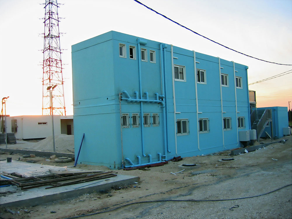
Visible Color #1, 2005, c-print, image: 45x60 cm, paper: 120x80 cm
Visible Color #2, 2005, c-print, image: 45x60 cm, paper: 120x80 cm

Visible Color #3, 2005, c-print, image: 45x60 cm, paper: 120x80 cm
Visible Color #4, 2005, c-print, image: 45x60 cm, paper: 120x80 cm

Visible Color #5, 2005, c-print, image: 45x60 cm, paper: 120x80 cm
Visible Color #6, 2005, c-print, image: 45x60 cm, paper: 120x80 cm
Visible Color #7, 2005, c-print, image: 45x60 cm, paper: 120x80 cm
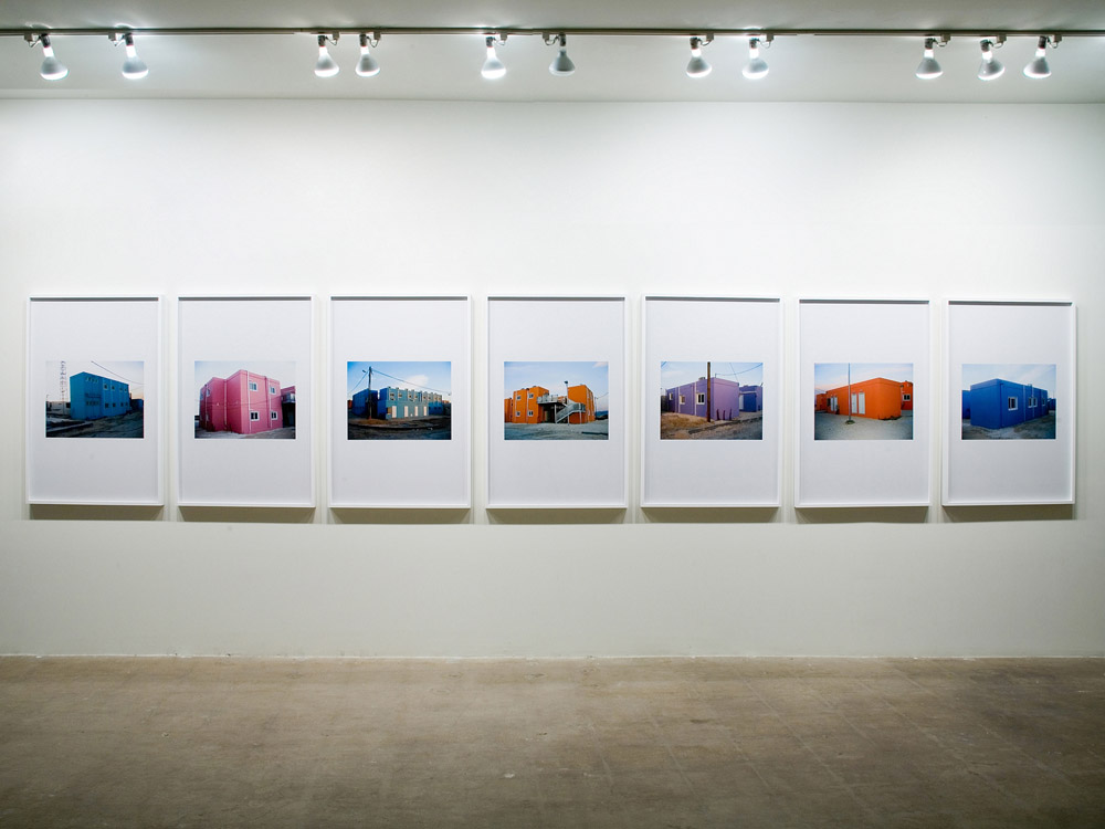
Visible Color, 2005, c-prints, installation view at Sandroni.Rey Gallery, Los Angeles, 2006
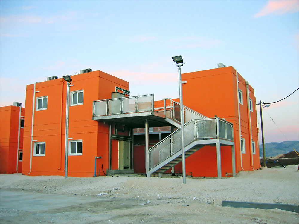
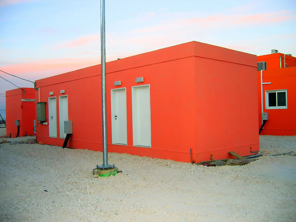
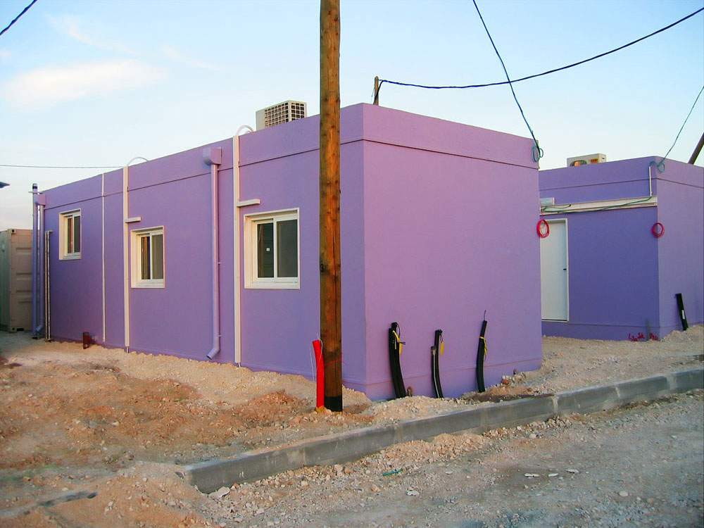
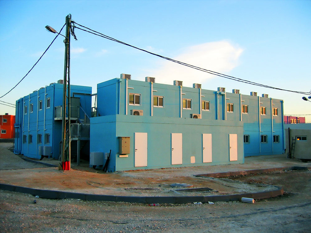
“The buildings in the Visible Color series look artificially, perhaps digitally colored, but they are, in fact, images of structures painted top to bottom in a uniform bold color: orange, pink, purple or blue. Toister calls our attention to the question of their ‘true’ color by including in each image an apparently artificial color marker: the uniform building colors themselves; the recurrent appearance of a magically blue pipe or an unusually intense red piece of wire tubing; and in Visible Color #2, an unmistakable and slightly disorienting contrast between the saturation of orange hues in two adjacent buildings. Are these color effects natural or artificial? Are colors themselves natural or artificial?“
(David Macarthur)
“Toister emphasizes the deconstruction of the photographic subject (that is to say, the violent treatment of reality) by means of overt digital interventions that erase portions of the photograph. This is the case in the series ‘Visible Color’ (2005), showing prefabricated buildings erected on a military facility for transferring goods between the West Bank and Israel. In some of the photographs, Toister leaves “visual noises” in front of, or beside the building. In others, the building is shown in a ‘sterile’ setting. The diagonal shot, drawing on modern photographic aesthetics, aggrandizes the building. It contrasts with the incomplete state of the picture, recognizable in the ‘visual noise’ in the foreground of the frame“
(Naama Haikin)